

HANDFUL is an invitation for creatives to slow down and connect with themselves and others through the medium of clay.
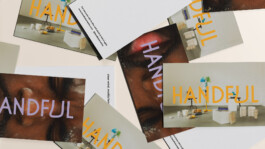
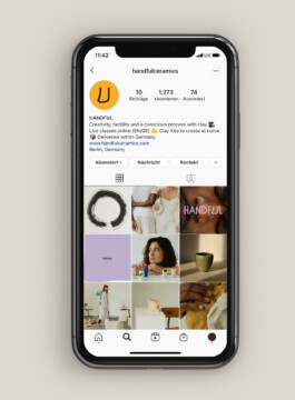
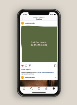
studio NANA developed the visual identity, logotype, image direction, and social media concept for the brand launch of HANDFUL.

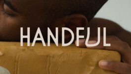
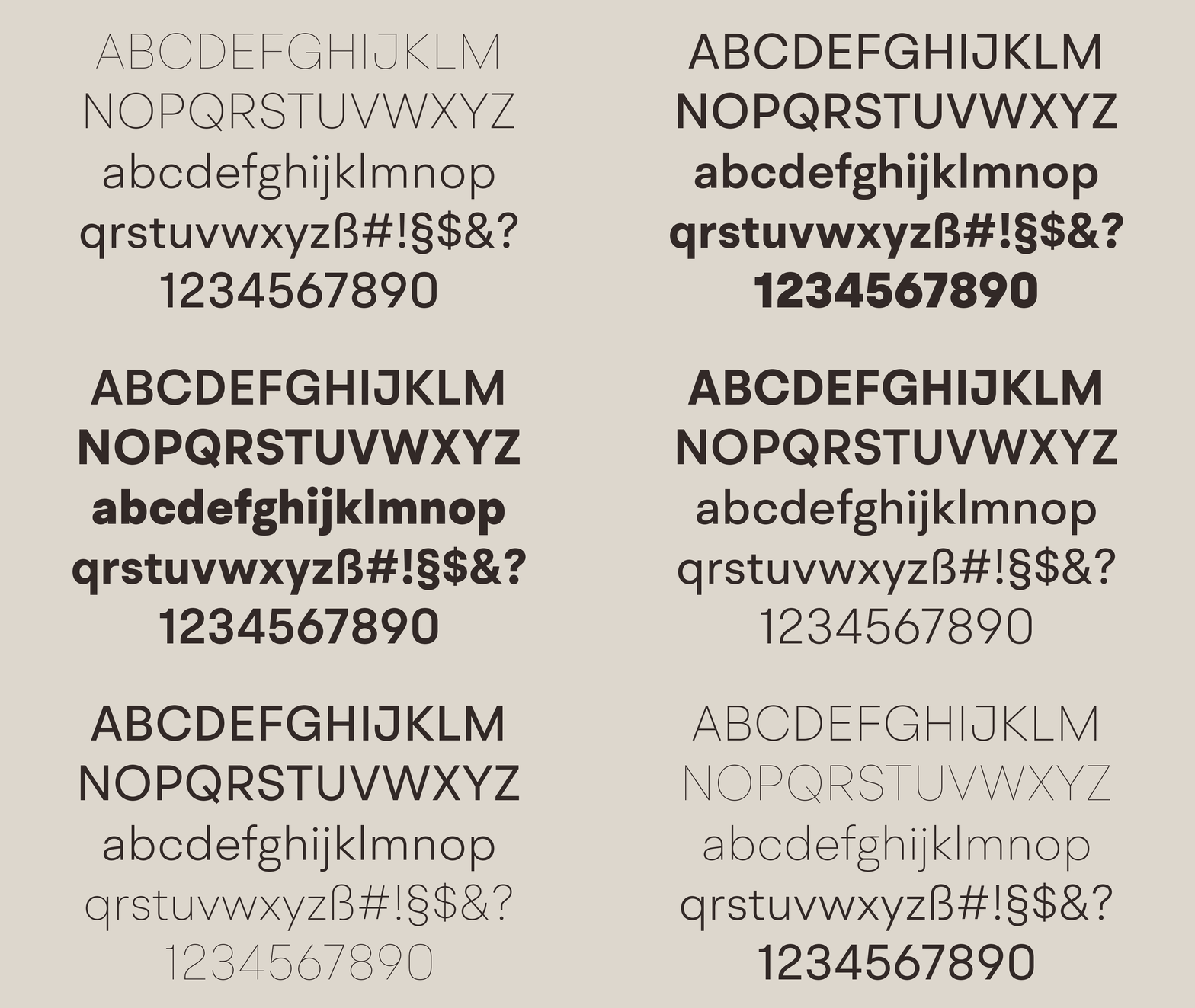
The constructed logo font reflects the inner calmness created by the process of working with clay. With its geometric and edgy outer shape contrasted by a soft and round inside, the logo represents a safe space to focus and unwind.
Being the only character without edges, the 'U' imitates the behavior of wet clay and symbolizes the 'you' — the person connecting with the clay.
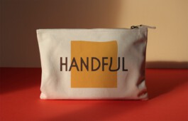
The square represents the clay body and reflects the behavior of the human body. When used in a digital environment, it creates awareness for the beauty of imperfection.
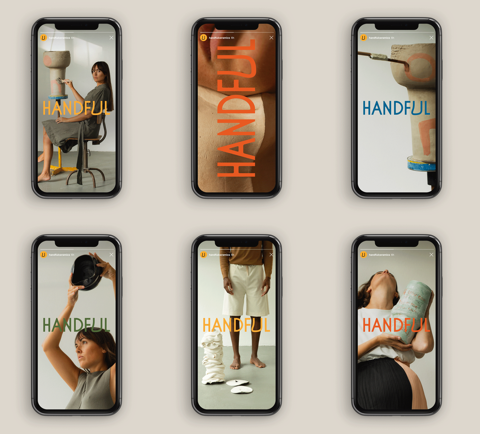
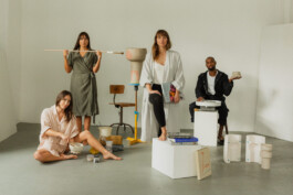
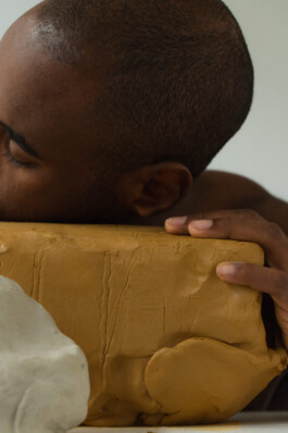
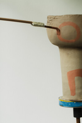
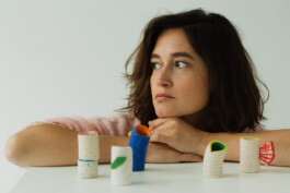
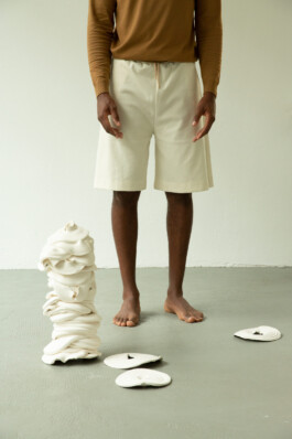
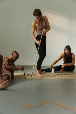
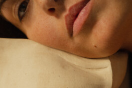
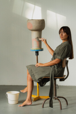
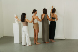
studio NANA defined the HANDFUL picture language and directed the brands photoshoot


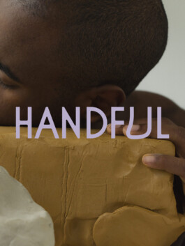
HANDFUL is an invitation for creatives to slow down and connect with themselves and others through the medium of clay.
studio NANA developed the visual identity, logotype, image direction, and social media concept for the brand launch of HANDFUL.

The constructed logo font reflects the inner calmness created by the process of working with clay. With its geometric and edgy outer shape contrasted by a soft and round inside, the logo represents a safe space to focus and unwind.
Being the only character without edges, the 'U' imitates the behavior of wet clay and symbolizes the 'you' — the person connecting with the clay.

The square represents the clay body and reflects the behavior of the human body. When used in a digital environment, it creates awareness for the beauty of imperfection.

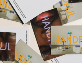


studio NANA defined the HANDFUL picture language and directed the brands photoshoot
